Periodical Photographs
Dan Winters
Aperture, 2009
156 pages, Hardcover, 9.5 x 11.5"
Reviewed by Tim McLaughlin
It came as some surprise to find that my copy of Periodical Photographs, if I wanted to buy it new again, would set me back over four-hundred and fifty dollars. The book, published in 2009, has become an instant classic.
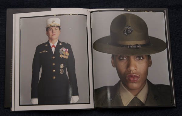
Which is understandable, as the book shares many of the qualities of Dan Winter’s photography: considered, balanced, richly detailed and with an edge of the odd and strange. The primary attraction for me, when I first encountered Winters, was his portraiture. His signature look consists of a saturated background that contrasts with the muted, slightly washed-out colours of the face. His subtle, carefully sculpted lighting enhances the effect. The style been highly emulated by photographers seeking to capture the power of his photographs.
The distinctive look of a Winters photograph is the result of his approach to colour. Winters, who has an eclectic background including photojournalist for Thousand Oaks News Chronicle was forced to shoot colour and to come to terms with it. In Lynn Hirschberg’s introduction to Periodical Photographs, Winters is quoted as saying:
The front page was colour, and I hated it. We all hated it. But I had to make my peace with color. I came to see it as my mission to give color photography the same power as black and white.
Portraiture for Winters involves consideration of the subject and the frame, high key lighting, and a wide depth of focus. In colour work the depth of focus is a mechanism to control the colour palette. In his 2009 interview with Ibarionex Perello1, Winters explains his approach:
Out of focus backgrounds work great in black and white but unless you’re very careful they can fail miserably in colour because you start to get that out-of-focus colour and you’re not really sure what the palette is, but if you’re sharp you can really discern what you’re looking at.
In response to the influence of his style, Winters has emphasized that: “Its more important to develop a sensibility, rather than a style.” He claims that style is the set-up, such that if you reproduced the set-up you would have the style. While sensibility is a far more abstract notion.
Sensibility for me would be: you formulate an opinion. You form an opinion about your surroundings and the way you respond to your surroundings and it starts to transcend the tools you use.
I think a lot of my portraits are really odd sometimes, you know, in kind of a good way. But I also feel like they’re reverent. I try to be flattering and, at the same time, make something that’s genuine and sensitive and reverent. I like the word reverent for portraits. I think its … I think we need more of that reverence for people and for their own experience, their own path and the way that they’re represented.
A sensibility, an opinion, opens up the possibility of a conversation. Photographs are always about more that what they show. And for Winters one of the things that he attempts to make his photos about is a person's character. Speaking about digitally retouching photographs to be more pleasing, or to conform to an industry ideal of beauty, winters claims: "I'm not interested in that kind of digital enhancement. I find it diminishes character, and character is why we are fascinated by these people in the first place."
That Winters can maintain his artistic sensibility when shooting celebrities is remarkable - especially given the number of personalities who have a stake in how the image reads: editors, publicists, agents, stylists, managers, marketers, etc. The stakes are high and something as ephemeral as a photographer's sensibility does not always carry the day.
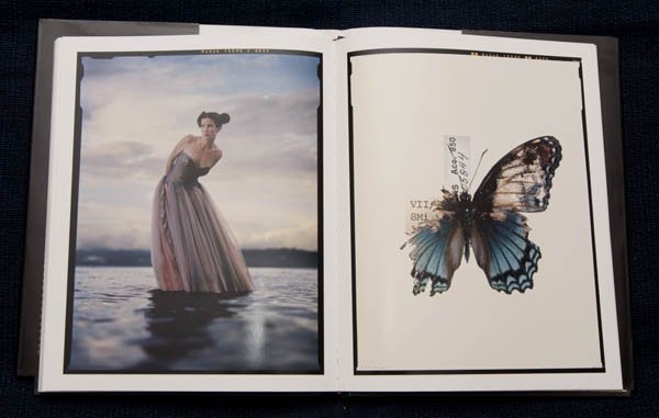
The portraits dominate Periodical Photographs so strongly that it is possible to overlook the fact that of the 86 images in the book 34 are not people. Instead they are buildings, abandoned cars or a variety of movie props including the hand of Kong (the stop-motion animation armature from RKO’s original 1933 production of King Kong), the prop from Rocketship X-M, and the alien’s head from This Island Earth.
In comparison to the portraiture the objects and landscapes are documents: Neat and clean but lacking the force of the portraits. Instead they are windows into the personality of Winters himself, they are portals into his interests and fascinations — his collector and archival tendencies – and his inquisitive, scientific mind. Some are practically illustrations and it comes as no surprise to learn that Winters is also a professional illustrator.
Periodical Photographs is the first Winter's monograph. Subsequent books include Dan Winters' America: Icons and Ingenuity and Last Launch: Discovery, Endeavor, Atlantis. As of the writing of this review Dan Winters has a new book available to pre-order Road to Seeing. Ibarionex Perello is listed as a co-author.
-----
1. The Candid Frame Podcast #85 - Dan Winters by Ibarionex Perello. Blog summary available here: http://thecandidframe.blogspot.ca/2009/11/candid-frame-85-dan-winters.html
I was first led to Winters by a mention in David Hobby’s Strobist Blog – yet another good reason to follow Mr. Hobby.